In this article
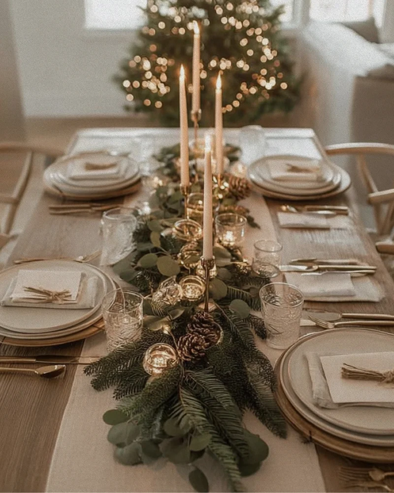
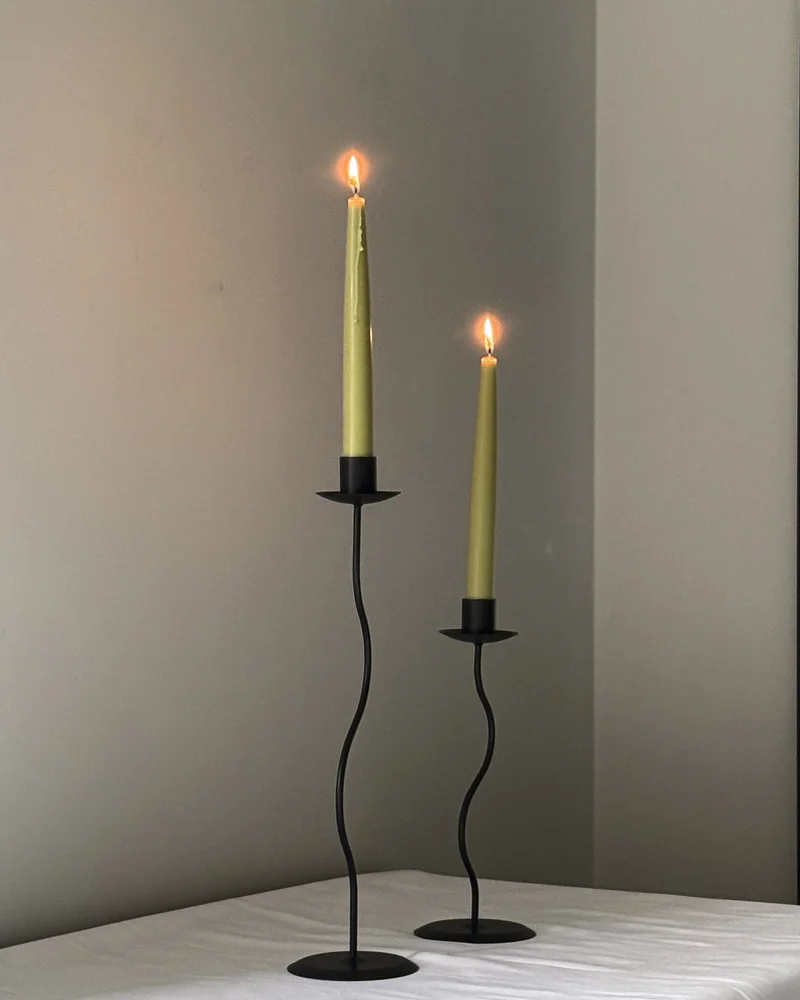
Choosing taper candle colours is a simple way to shape the atmosphere of a dining table. The right palette can echo the materials already in the room, complement a table setting or introduce a more expressive contrast. Start with the colours that are already present. Look at the table, chairs, ceramics, linen, glassware and any flowers or foliage. Taper candles work best when they relate to at least one element in the setting, even when they are used as a clear accent.
Start with the atmosphere
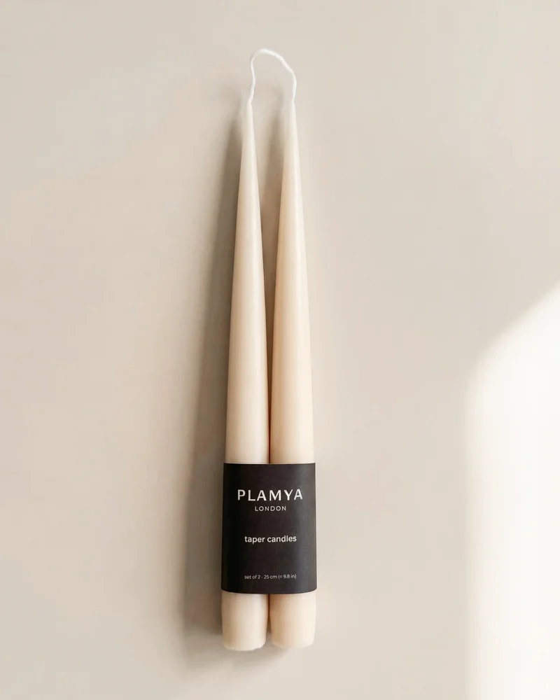
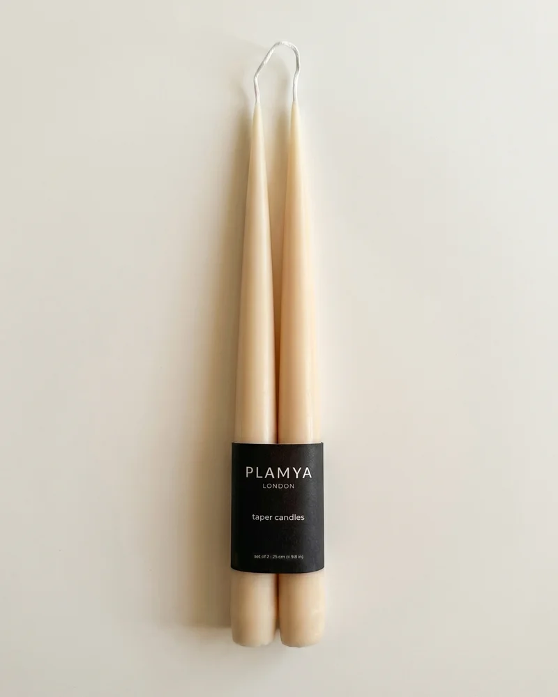
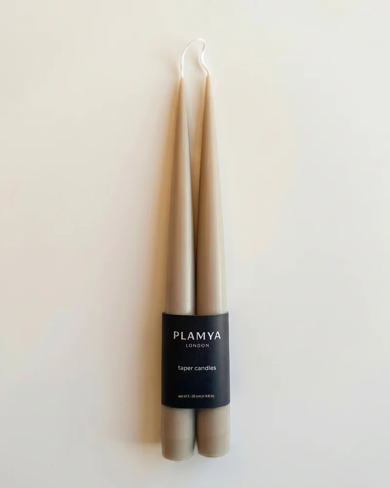
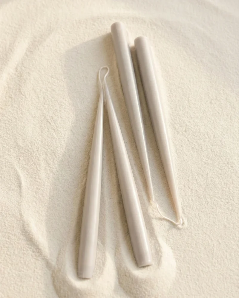
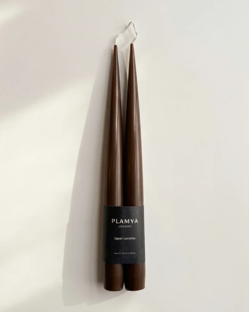
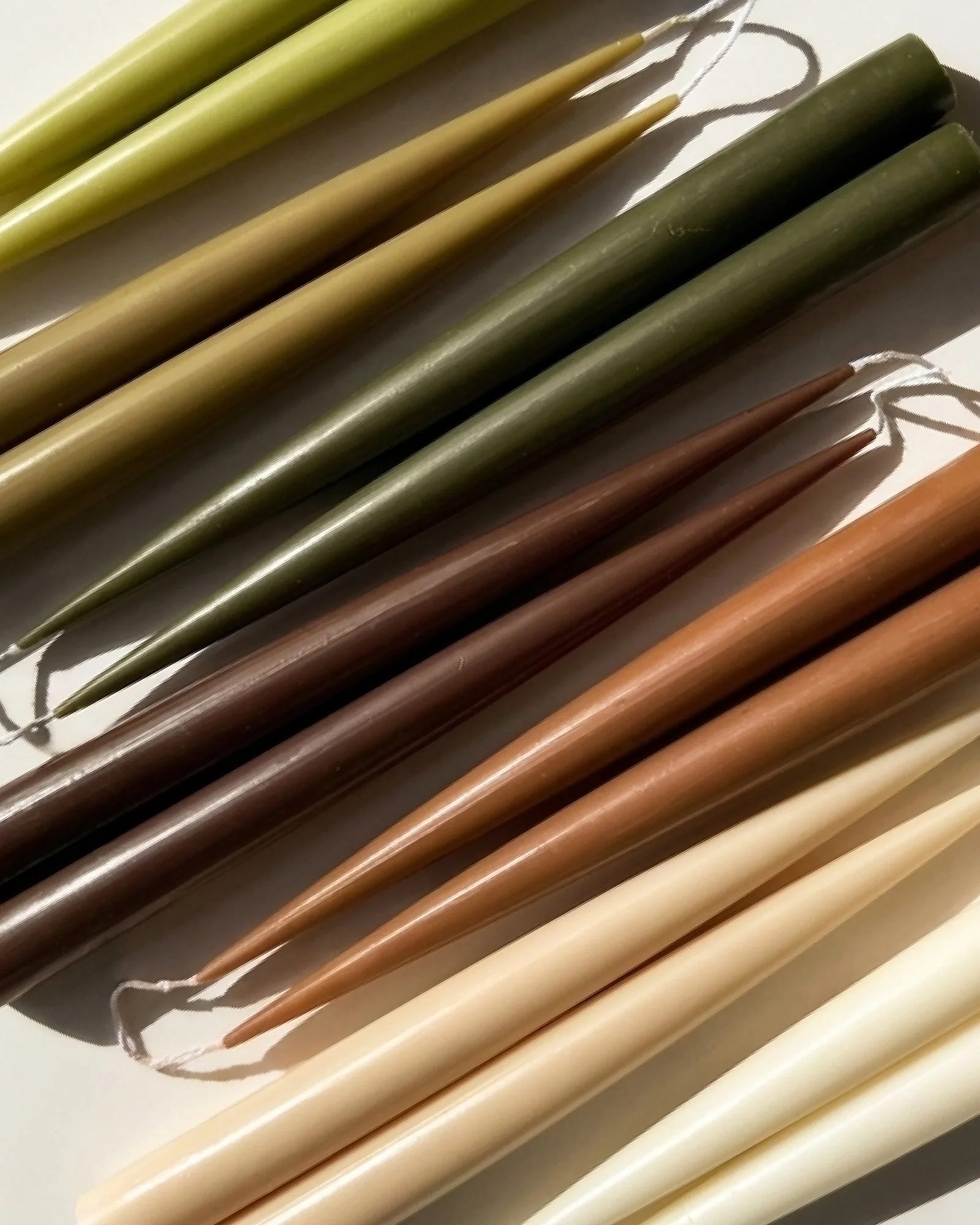
For a calm, neutral table, choose soft shades such as Soft Ivory, Ash Grey, Earth Brown or Warm Clay. These colours sit naturally alongside linen, pale ceramics, light wood and stone surfaces.
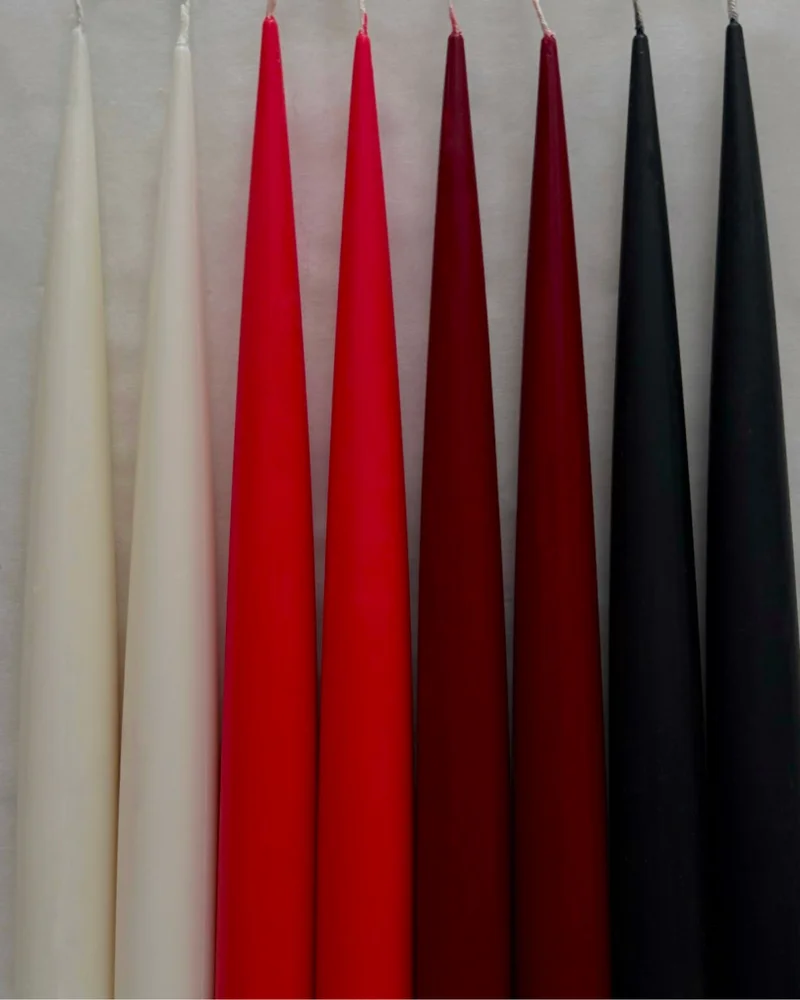
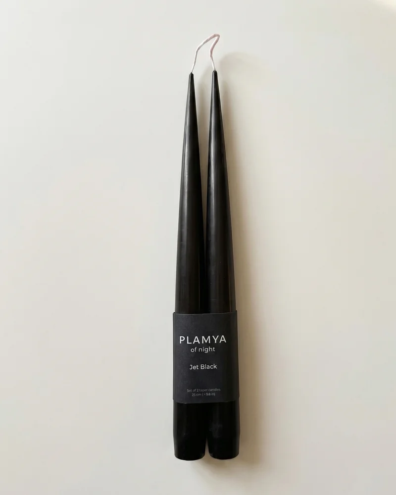
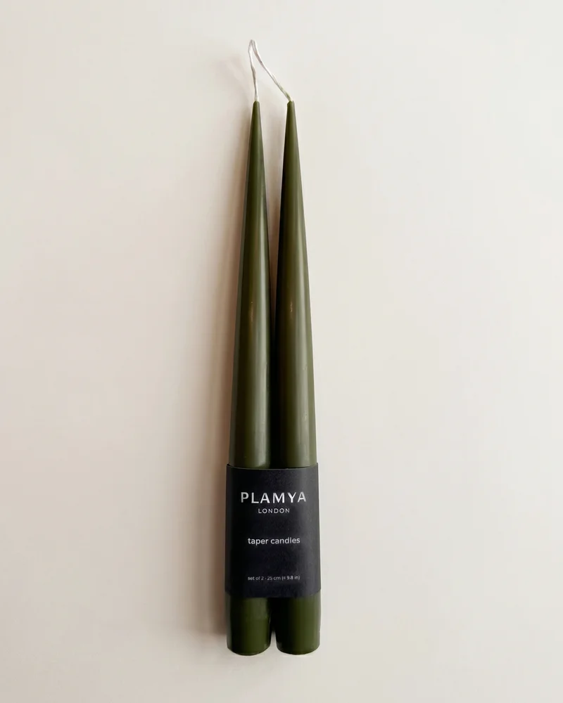
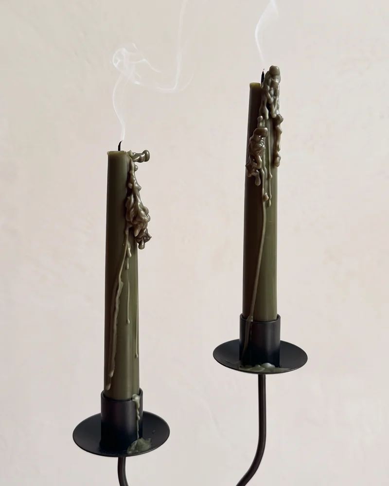
For a deeper, more atmospheric setting, use shades such as Deep Burgundy, Jet Black or Deep Pine. They bring more visual weight to the table and work well with darker wood, evening light and richer materials.
Brighter colours can create a more noticeable focal point. Vivid Red adds energy to a simple setting, while warmer clay and earthy tones introduce colour with a softer feel.
How to combine taper candle colours
There are several ways to build a candle palette.
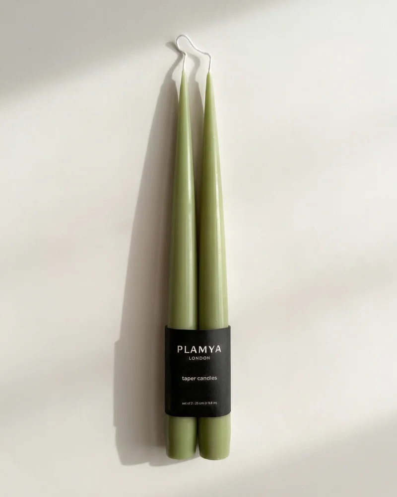
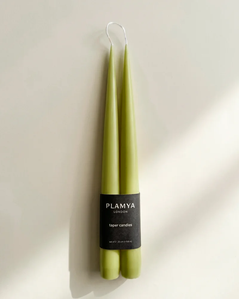
You can use different shades from the same colour family. Combine burgundy with red, or Deep Pine with Matcha and Sage Mist. The result feels considered while still having enough variation.
You can also create contrast by pairing a lighter shade with a darker one. Soft Ivory with Deep Burgundy is a clear combination for a dining table. Ash Grey with Vivid Red creates a sharper, more graphic palette.
For a more relaxed arrangement, combine two or three earthy colours. Warm Clay, Earth Brown and Deep Pine work well with natural wood, ceramic tableware and linen.
Matching candles with materials
The material of the table setting can help guide the colour choice.
Light linen and pale ceramics pair naturally with ivory, grey, clay and muted brown shades. These combinations keep the table feeling open and understated.
Deep Burgundy works particularly well with a red wine setting. The colour picks up the tones of the wine and creates a richer composition across the table.
When flowers or green foliage are part of the arrangement, Deep Pine, Matcha or Sage Mist can connect the candles with the natural colour of the stems and leaves.
Dark wood and black or charcoal details can support stronger shades such as Jet Black, Deep Burgundy and Vivid Red. Use them with enough space around each candle so the arrangement remains balanced.
Use the table as a guide
The number of colours you choose should relate to the size and style of the table. Two colours are often enough for a smaller setting. On a larger table, three shades can create a more varied composition without making the arrangement feel busy.
If the table already contains several colours, choose candles that repeat one or two of them. If the setting is mostly neutral, the candles can introduce a stronger accent.
The most useful approach is to begin with the room and the materials already in front of you. From there, choose a palette that supports the setting and reflects the atmosphere you want to create.

Tanya develops every PLAMYA colour and wax blend, and makes each candle by hand in the London studio.
Our storyPublished 12 October 2026